Project 6 - Wine Quality Prediction using Machine Learning with Python
My Machine Learning Beginner Projects, Entry 6


I am Salim Olanrewaju Oyinlola. I identify as a Machine Learning and Artificial Intelligence enthusiast who is quite fond of making use of data and patterns to develop insights and analysis.
In my opinion, Machine learning is where the computational and algorithmic skills of data science meets the statistical thinking of data science. The result is a collection of approaches that requires effective theory as much as effective computation. There are a plethora of machine learning model, with each of them working best for different problems. As such, I believe understanding the problem setting in machine learning is essential to using these tools effectively. Now, the best way to UNDERSTAND different problem settings is by PLAYING AROUND with different problem settings. That is the genesis behind this writing series - My Machine Learning Projects. Over the course of this writing series, I would solve a machine learning problem daily. These problems will range from a plethora of fields whilst requiring and covering a range of models. A link to my previous articles can be found here.
Project Description: This project involves the binary classification of wines into good and bad quality based on a set of properties.
URL to Dataset: Download here
Line-by-line explanation of Code
import numpy as np
import pandas as pd
import matplotlib.pyplot as plt
import seaborn as sns
from sklearn.model_selection import train_test_split
from sklearn.ensemble import RandomForestClassifier
from sklearn.metrics import accuracy_score
The block of codes above imports the third party libraries used in the model.
import numpy as np imports the numpy library which can be used to perform a wide variety of mathematical operations on arrays.
import pandas as pd imports the panda library which is used to analyze data.
import matplotlib.pyplot as plt imports the PyPlot function from the MatPlotLib library which is used to visualize data and trends in the data.
import seaborn as sns imports the seaborn library which is used for making statistical graphics. It builds on top of matplotlib and integrates closely with pandas data structures. Seaborn helps you explore and understand your data.
from sklearn.model_selection import train_test_split imports the train_test_split function from sklearn's model_selection library. It will be used in spliting arrays or matrices into random train and test subsets.
from sklearn.ensemble import RandomForestClassifier imports the RandomForestClassifier ML model. The classsifier is an emsemble learner built on decision trees.
from sklearn.metrics import accuracy_score imports the accuracy_score function from sklearn's metrics library. This model is used to ascertain the performance of our model.
salim_wine_dataset = pd.read_csv(r'C:\Users\OYINLOLA SALIM O\Downloads\winequality-red.csv')
Loading the dataset to a Pandas DataFrame named salim_wine_dataset.
salim_wine_dataset.shape
This line of code returns the number of rows & columns in the dataset.
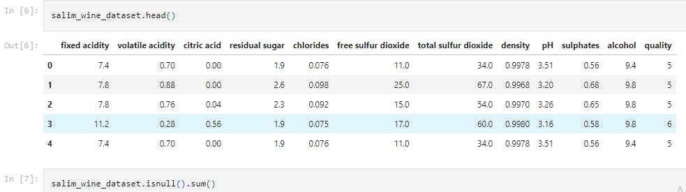
salim_wine_dataset.head()
This line of code returns the first 5 rows of the dataset.
salim_wine_dataset.isnull().sum()
This line of code checks for missing values in the dataset.
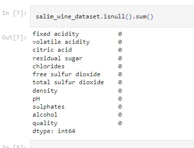
It shows that there is no missing values in the dataset.
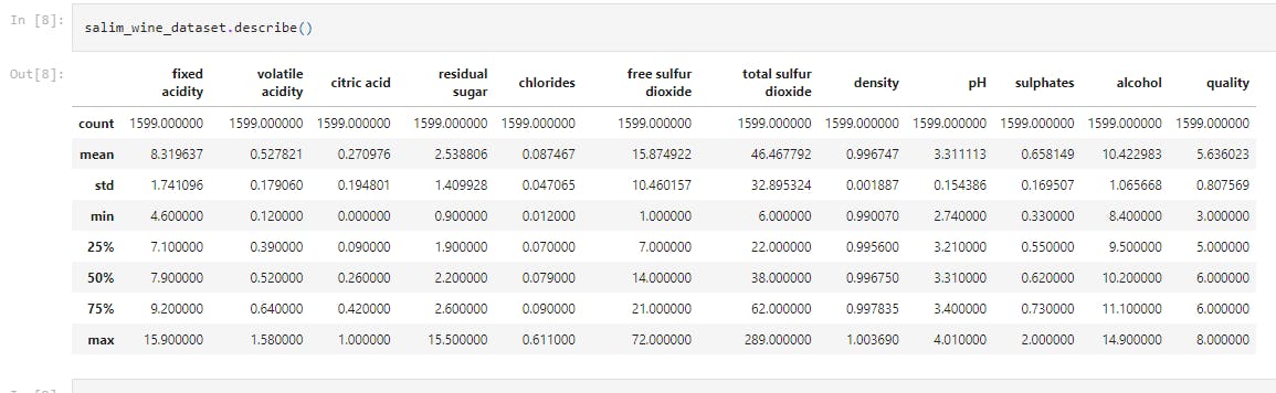
salim_wine_dataset.describe()
This displays the statistical measure of the data (i.e. the mean, median, max, min 25th, 50th, 75th percentile values etc.)
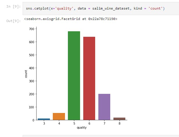
sns.catplot(x='quality', data = salim_wine_dataset, kind = 'count')
This displays the number of values for each quality in a catplot.
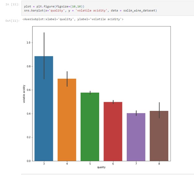
plot = plt.figure(figsize=(10,10))
sns.barplot(x='quality', y = 'volatile acidity', data = salim_wine_dataset)
This displays the bar chart between Volatile Acidity vs Quality.
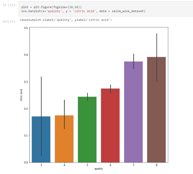
plot = plt.figure(figsize=(10,10))
sns.barplot(x='quality', y = 'citric acid', data = salim_wine_dataset)
This displays the bar chart between citric acid vs Quality
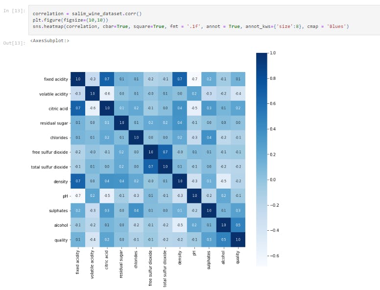
correlation = salim_wine_dataset.corr()
plt.figure(figsize=(10,10))
sns.heatmap(correlation, cbar=True, square=True, fmt = '.1f', annot = True, annot_kws={'size':8}, cmap = 'Blues')
This block of code constructs a heatmap to understand the correlation between the columns.
X = salim_wine_dataset.drop('quality',axis=1)
Y = salim_wine_dataset['quality'].apply(lambda y_value: 1 if y_value>=7 else 0)
This block of code separates the data and Label.
X_train, X_test, Y_train, Y_test = train_test_split(X, Y, test_size=0.2, random_state=3)
The train_test_split method that was used earlier is hence called and used to divide the dataset into train set and test set.
- The 0.2 value of test_size implies that 20% of the dataset is kept for testing whilst 80% is used to train the model.
model = RandomForestClassifier()
model.fit(X_train, Y_train)
This initializes an instance of the Random Forest Classifier model and also trains the support vector Machine Classifier with the train dataset.
X_test_prediction = model.predict(X_test)
test_data_accuracy = accuracy_score(X_test_prediction, Y_test)
print('Accuracy : ', test_data_accuracy)
This block of code evaluates the accuracy score on the test data. We see an accuracy score of 0.93125.
#Step 1
input_data = (7.5,0.5,0.36,6.1,0.071,17.0,102.0,0.9978,3.35,0.8,10.5)

# Step 2
input_data_as_numpy_array = np.asarray(input_data)

# Step 3
input_data_reshaped = input_data_as_numpy_array.reshape(1,-1)

#Step 4
prediction = model.predict(input_data_reshaped)
print(prediction)

if (prediction[0]==1):
  print('Good Quality Wine')
else:
  print('Bad Quality Wine')
This is the most complex part of the code and will be explain in steps.
Step 1 - This is the user inputted value for all x values i.e (fixed acidity, volatile acidity,citric acid, residual sugar, chlorides, free sulfur dioxide, total sulfur dioxide, density, pH, sulphates, alcohol)
Step 2 - This changes the input data to a numpy array.
Step 3 - This reshapes the data as we are predicting the label for only one instance.
Step 4 - This prints the result of the prediction.
That's it for this project. Be sure to like, share and keep the discussion going in the comment section. .ipynb file containing the full code can be found here.